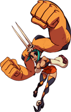
My name is Brian Jun, otherwise known as EU03 elsewhere on the Internet. I’m currently intern-turned-assistant art monkey for the rest of the art department at Reverge Labs.
Being one who can fumble through digital imaging, I’m assigned some of the more mundane clean-up tasks… some of which cause me to frown furiously at times. This work includes processing and double-checking assets from the team in order to make sure things go smoothly, which doesn’t happen as often as I’d like. During those times, I crawl into a fetal position and cry my eyes out.
…But there is something that makes this all worthwhile. Oh yes. I don’t mind these things because I have another job on Skullgirls that is unique to the rest of the team.
I suppose a fancier title would be called “color coordinator.” Fashion designer, maybe? Basically, I’m responsible for the character palettes. I don’t do this entirely on my own. as I get some help from team friend Devin “Urichinan” Mills, but ultimately I decide what goes into the game.
This is simultaneously important and not-so important. It isn’t so important in the sense that it contributes to the gameplay, but something as simple a a character color palettes can add a lot to the player’s enjoyment of the game. As we continue to push out newer builds for the press and public to see, it’s also important for presentations that people are able to see different colors other than the standard 1P and 2P palettes.
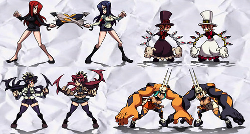
I feel that a good set of color palettes is a part of what makes fighting games memorable. It also helps players express themselves, and players can pick and settle down with their personal favorites to use as they grow more attached to the character and the game as a whole. Some people even get famous for playing with a particular color, like Mike Z’s famous green Tager. And as we’ve seen with the infamous Mango Sentinel, they can even spark new phenomena about basketball teams! Since I dabble a bit in illustration and painting, it gives me a lot of pride to be able to have some of my skills be represented in the game, and I have every intention of making the Skullgirls character colors memorable.
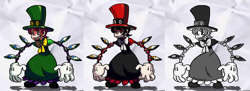
Designing the initial color scheme is part of the conceptualization process, where Alex then paints and renders onto a model sheet for a character. From these painted colors, he and I can directly translate the base colors and tones onto the original character palette. A good and strong palette can speak volumes about a character’s personality, such as Cerebella’s bright and vibrant orange to Parasoul’s moody blacks. However, Alex’s unique style often begs different interpretations in order to express such characterizations further. Sometimes, we might want to push these personalities further into one extreme direction. Other times, we might want to show a different side of the character. And for the other occasions (or maybe the majority of the time on Skullgirls), we just want to have particularly funny or interesting homage colors, especially the ones that makes our inner nerds squeal.
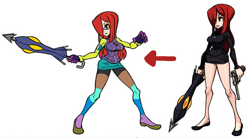
Now, technically, our colors aren’t “palettes” in the traditional sense. From the character model sheet, a character is given a color map which Alex and I design: basic flat colors that designate what areas are affected by what colors, as seen previously in Richard’s blog post. This information is passed onto the rest of clean-up which maps these colors accordingly. I also use it as a base template in order to create a color scheme quickly. With a lot of careful planning, Alex can plan out some clever maps from even a basic design, such as the alternative glasses and leggings on Parasoul… not to mention bring the clean-up crew to tears, because these seemingly little details can add a lot to the time it takes to color the character.
What comes to mind when I create a palette? Instead of limiting myself to “I want to use this and those colors,” I rather think about what colors best express the kind of character and personality I want. For example, when dealing with Cerebella, I draw on her circus background and choose to use very bright and gaudy colors without having them clash too much. For Peacock, colors that made her look mischievous, such as green, came to me naturally.
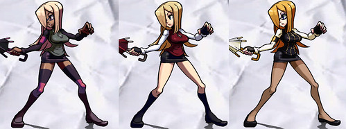
Parasoul, my current favorite to work on, had me gravitating heavily towards black, white, red, and gold to emphasize on her femme fatale look – her palettes practically came flowing out of my hands.
Once I finish creating these, I confer with Alex to make sure they are to his liking. Afterwards, I begin to input these color values into the game. Thanks to the amazing depth map engine, creating palettes is less of painting by the numbers and more of an actual illustration approach. Instead of the traditional 2D sprite approach where specific sections of the sprite are strictly designated to one color, the depth map allows me to choose a range of colors that will be shown on a portion of the sprite. Through some techno-wizardry, the colors I pick are represented through some averaging, creating that illustrated look that Skullgirls is known for. Utilizing this, I can decide on the sort of appropriate texture with the color.

Peacock demands a lot of metallic effects, so I’ll pick high-contrast shades to get that chrome look. Cerebella feels like she would have a mostly cloth wardrobe, so she mostly gets a matte look, while Parasoul often is paired up with some nice gloss to really emphasize her appeal.
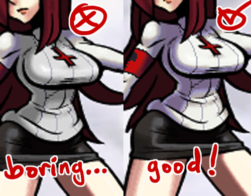
With that decided and the basic shades down, next is choosing color shifts for the highlights and darker tones. Sometimes, I feel it’s more appropriate to have cooler highlights and warm shadows. Other times, I think the opposite works better, with redder lights and bluer shades. With the palette engine, I can especially create interesting combinations, such as ambient lighting and core shadows that pop out. But the most important detail that I try to keep in mind is to always maintain a good level of contrast with individual colors and as a character as a whole. This emphasizes good readability, important in a fighting game, and also reflects Alex’s own unique and bright coloring style. Once all the colors are settled in, Alex and I go over the colors once more for some final tweaking and testing, pass it around the office for a quick approval, and then the palettes are imported into the game.
However, my favorites are working with homage and parody colors; some characters are just way too tempting to pair up with some familiar colors. It’s particularly fun to watch others’ reactions on seeing some of them for the first time. As Internet hype continues to grow for Skullgirls, I’ve been mindful of the many suggestions that fans want to see in the game.
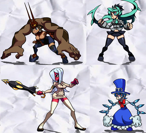
Can you identify all the ones I’ve managed to sneak into the game? While I can’t make any promises and, quite frankly, will flat-out deny some requests, I will say that there should be some that will absolutely delight many people.
Thanks for reading!

