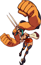
Hi, this is Mariel, lead animator on **Skullgirls**. I’m here with animator Jon “Persona” Kim, and we’ll be talking about some of the more difficult bits of animating ***Skullgirls*** today.
We’ll be discussing the kinds of details we focus on when trying to create a consistent look as we work with our army of external contractors. With so many people working on the game, it’s imperative we get these things right to keep quality high and the animations from becoming disjointed.
There’s a lot that goes into getting the flow of character motion to look right. A lot of this comes from having a strong understanding of anatomy, draftsmanship, and appeal. It may be surprising to learn that life drawing is absolutely essential to making ***Skullgirls***’ animations look right – I can’t emphasize enough how important it is to have studied and drawn the human figure for countless hours. Even though we’re doing a really stylized game, it doesn’t change the fact that you need a really solid understanding of how human bodies work. You need a strong fundamental basis to work off in order to really get the animation looking believable and powerful, because our brains are hard-wired to spot inconsistencies in human shapes, even if they’re exaggerated ones. And since we’re making a fighting game, our animators need to know how to draw the human figure at any angle and any pose. You can’t fake it: every frame of animation is hand-drawn, so really understanding how the human form works and moves is necessary.

To get the animation to look right, it’s important to understand the basics of squash and stretch, spacing and timing, but also secondary and follow-through animation. We’re really striving to have the best animation we’re capable of, and that means there aren’t any shortcuts or easy ways to tackle the animation production. Even though everything is drawn into Photoshop, we avoid using shortcuts like cloning and rotation. Flash animation tends to rely on those, and it while may work for other games, it doesn’t fit the ***Skullgirls***‘ style and usually ends up looking odd and lifeless. Minute joint and body motions may seem like details, but they really sell the animations and make them look natural, and you’re going to lose those details if you take shortcuts. Of course, there are situations where cloning might look correct, such as where it’s subtle motion where only the clothing moves or body parts move just a few pixels or to keep consistency in proportions for a quick pass in the animation, but it shouldn’t be the final result as it will still often look unnatural or inappropriate.
Something unique to fighting game animation is that we need to animate moves that adhere to specific frames counts. Unlike traditional animation that can spend as much time as necessary to convey what it needs to, fighting game animation needs to adhere to the player’s button presses so that the resulting gameplay feel is snappy, satisfying and visceral. This means that we need to know how to interpret and use the amount of frames they have to work with to convey the proper amount of “oomph” an attack should have followed by the level of detail and follow-through a big amount of motion such as an attack would have. In a lot of cases, we find that the best way to convey a quick, strong attack is to simply snap to the active, attacking pose, and then having the character’s hair and clothes flow afterwards to really sell the motion when the attack itself only had a few frames to play. An additional benefit is that the player can cancel the animation after the key pose, so it never obstructs gameplay when it’s done this way.

One thing we struggle with in cleanup is lighting. We differ from traditional studio animation in that our animators don’t animate the shading on our characters, so our cleanup artists need to be able to interpret what the animator was going for and then render it in a suitable manner. This includes adding shadows that really understand the masses of the body and how the light would play off of it, but also working in a way that makes the drawing stylish and appropriate to the rest of the game. This is in addition to the traditional clean-up duties of keeping the character consistent and on model, as our animation starts a bit rougher.
So there you have it: the details we strive for with our animation.
If this has inspired you and you’d like to try out for the team, [check out our jobs **page**](http://revergelabs.com/jobs/) and try applying for a test!
*[Like us on Facebook](http://www.facebook.com/skullgirls) or follow [@**Skullgirls** on Twitter](https://twitter.com/#%21/skullgirls) to get the latest **Skullgirls** news and information!*
Animation: Getting the Details Right
Written by:

