The HUDsucker Proxy
July 18th, 2011
Written By: Ben Moise
My name is Ben, and I’m an engineer here at Reverge Labs.
Reverge is a small developer, so, like many of my coworkers, I need to wear many different hats in the effort to make Skullgirls the best fighter you’ll play this year. On any given day, I could be putting together a build of the game for one of the public showings, chasing down and fixing bugs, setting up the (excellent) GGPO networking library that’ll drive our online play, or, my latest creation, setting up the in-game heads-up display (HUD) that you’ll see in game.
Playing games growing up, I never gave much thought to the HUD, but once I joined The Industry I learned of all the work that goes into creating user interfaces that are informative, unobtrusive, and pleasing to the eye. It involves all disciplines and extreme amounts of iteration, even by game development standards.
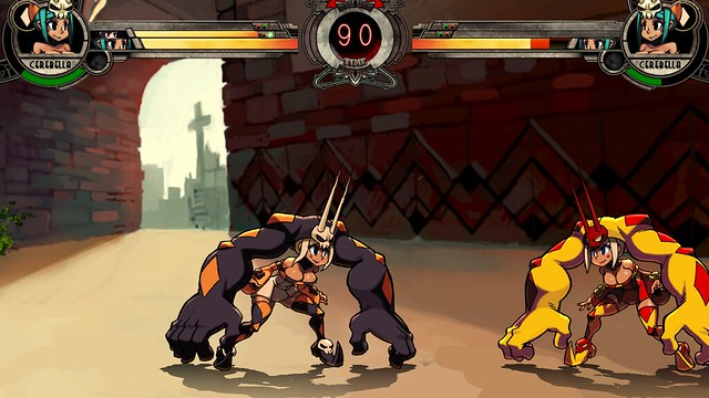
If you’ve been following the game at the various events we’ve shown the game at over the last few years, you may have noticed the progression of the HUD over the past few months. Today I’ll pull back the curtain and show you some UIs past and present to illustrate how it’s evolved.
This original version was made by Mike Z before I joined the company. It was done entirely “by hand” in code, drawing boxes and placing pixels using numbers placed directly in source. It’s pretty basic!
Here you can see one of my earliest tasks. It was to rebuild the HUD using textures, to match the HUD concept we’d gotten from our off-site UI Artist, Brady. This version was more a proof-of-concept than anything, hacked up to make sure the initial concept worked with the style of the game and didn’t get in the way of the action. I built up a small system to read in values from a text file, rather than rely on numbers hard-coded into the code source. While this allowed us to iterate quickly on the HUD, we were still missing several important features that any good UI has, such as animation and scaling.
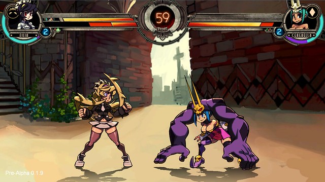
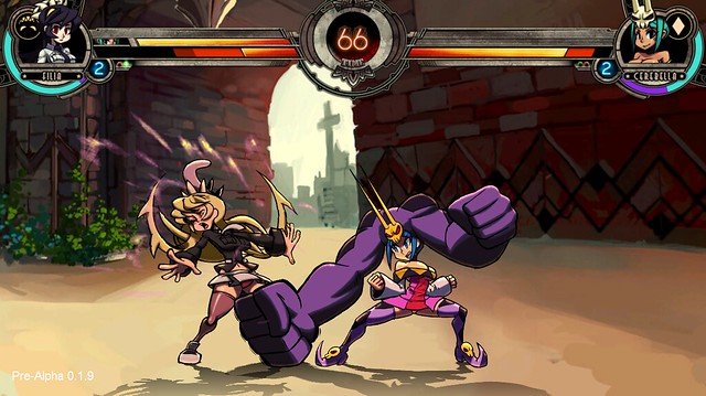
Here you can see the next this – to get the animation going, we licensed OtterUI, a UI middleware and Interface creation tool created by our friends and former coworkers at Aonyx Software. As a visual editor, Otter made it really easy to place objects: just drag and drop, instead of estimating an on-screen pixel position. It also got us animation, so we were able to put in the fancy slide-in-slide-out behavior the combo meter uses.
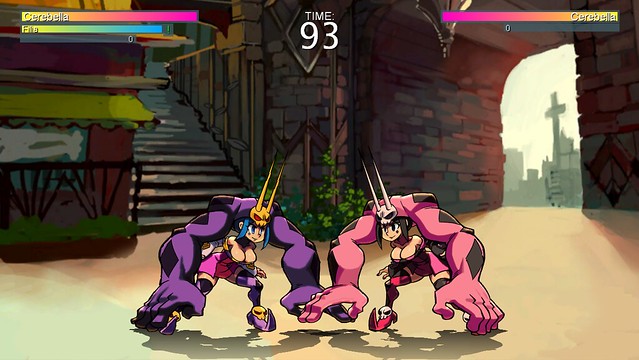
Once this version of the UI was in, we started to get feedback from around the office and from fans at events. Alex thought the small eye portrait was unnecessary, as we had the large character portrait there. Mike thought that, at low health, the health bar and the blood bar were indistinguishable from one another. People at cons mentioned the the super bar, then horizontal beneath the health bars, didn’t communicate the level very well.
So, we iterated!
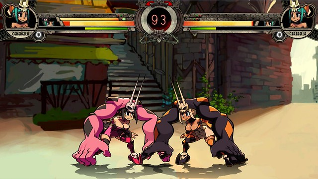
Alex and Brady started talking about new UI design. E-mails went back and forth for a few weeks as they discussed what they wanted the UI to look like, and how they wanted it to communicate information. While the eye issue took a few iterations to sort out, they settled on the new, “curved” super bar fairly quickly. Otter didn’t support an object that behaved like that, but it did allow me to create custom objects, so I wrote the code needed to draw the circular bar, as Brady provided use with new art to surround the new super meter.
Mike and I talked about various different ways to keep health and blood bars visually different. We requested new bar art with different colors from Brady, hoping they’d “pop” more. We changed the logic which made the bars grow and shrink, and added some code to perform some neat tricks with texture mapping. That got us most of the way there, but it still wasn’t right. Someone struck upon the idea that we could add a “divider” at the end of a texture, and we requested the art from Brady.
Brady came back with this major iteration of the HUD, incorporating the things I’ve talked about, as well as a ton of other minor things I haven’t mentioned. I put in all the new artwork, and showed it off the people around the office.
Feedback came in quick! We put in a flashing texture to show when you’ve taken damage. We sent a request for new combo counter art. Our intern, Jon, pointed out that the current blood bar doesn’t do a good job of informing you how much damage you’ve dealt during a combo; we quickly threw in a temporary indicator to see if it worked, and sent a request to Brady for real art.
This coming week, I’ll be finishing up a pass on some PSN logic, but after that I’ll iterate on the HUD again; Brady sent us new art reflecting that feedback a few days ago. And then I’ll show it off around the office to see what else we can do to improve.
So there’s a small sample of what it’s like working on a UI – it’s all really time-consuming, but since the HUD is such a crucial part of the look, feel and functionality of the game that you can’t take shortcuts here.
Finally… just because of how often we hear it, it must be said: the character select screen isn’t final! It’s still using that in-code, pixel-placing method I mentioned near the beginning of the post. To prove it, I’m going to end with a sneak peek at the current character select concept, which will form the basis of my next major UI task.
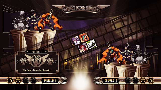
By the time it ends up in a build for general consumption it should look great, having gone through the same endless iteration the HUD has.
Thanks for reading!