Character Design: Big Shapes Vs. Small Details
May 9th, 2011
Written By: Alex Ahad
Hey guys, this is Alex Ahad, creative lead on Skullgirls.
Today I’m going to talk briefly about the types of things I consider most important in character design. Most of the examples I’ll discuss today come from video games, but obviously the ideas mentioned here apply to any media.
Above all else, the basic theme and essence of the character should be in the forefront, particularly emphasized by their inherent structure, shape, and silhouette. You should be able to tell what kind of character they are from far away, with only a few key points highlighted. This trumps any sort of smaller details, such as what sort of accessories they are wearing, details on their clothing, or their hair style. A fantasy elf with form-fitting armor will always be a fantasy elf with form-fitting armor, no matter how many details you add to said armor. Likewise, a bald space marine will always be a bald space marine, no matter what kind of gun he’s holding or how many veins he has on his skin.
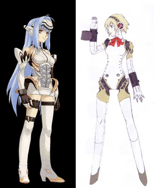
Let’s compare Persona 3’s Aegis with Xenosaga’s KOS-MOS. I like KOS-MOS’s Episode 1 design a lot, but this comparison is still useful to get my point across.
If you were to look at both characters from afar, you’d see that Aegis’s design is generally a lot simpler and more streamlined than KOS-MOS’s. Both of these characters are robot girls, but if you were to look at their outfits and structure, KOS-MOS could come across as a girl wearing a bunch of machinery on top of her human-shaped body. However, Aegis sells the “robot girl” aspect instantly with almost no additional details by simply exposing her shoulder and hip joints, in a way that clearly cuts into what would otherwise be a normal human silhouette. Her shape is that of a human torso and head piece connected to limbs, making it instantly clear that Aegis is not a human. She doesn’t need random technological nonsense on her body or anywhere else, really – just being able to see those mechanical joints and hands is enough to sell it.
I like characters that can sell their theme or design in a very simple, fundamental manner. Details are neat, but more of a bonus: if the color of a character’s hair or placement of their bangs is the only way you can tell one character apart from another, something went wrong. Belts, buckles, metal plates or zippers can be good accents, but if a character is just full of that nonsense for no real reason, then it’s pointless detail that just ends up becoming distracting.
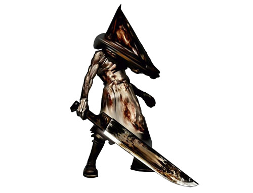
Another character design I like is Silent Hill 2’s Pyramid Head. In general, I like the monster designs in Silent Hill 2 a lot because they have a very unique and unified direction. All of them have a very feminine, even erotic, element to their designs, which makes them more memorable and disturbing. You can add all the angry spikes and sharp edges and torn up limbs and pus and blood to a human, and you’ll end up with the same zombies and generic monsters you see in a majority of survival horror games. However, the way the monsters in Silent Hill 2 ended up was much more elegant… and also a lot more disturbing. Pyramid Head himself stands out from the rest of the monsters, since he represented a very masculine counterpart to the other feminine monsters, and it fit perfectly with the context of the story.

Comparing Pyramid Head to other character designs, he has one very obvious feature that makes him stand out very easily: the pyramid. You can add all the stitches, cuts, claws, cool weapons, and trench coats you want to a design, but if its silhouette just ends up being another generic monster buff guy, then I think the design has fallen short. With a single distinct shape, Pyramid Head is able to convey a very unique design instantly: it doesn’t matter that Silent Hill 2‘s version has the apron and gloves or the the movie version has the sarong made of human flesh.
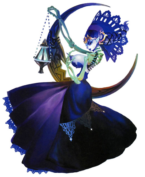
I also really enjoy Odette’s design from Odin Sphere. She’s most likely based off of the Norse goddess “Hel,” who is often described to be half-rotten or half-skeletal. I think most interpretations of Hel would be something, like, having one side of her body be a skeleton, Two-Face style, but the way this detail is approached with Odette is very cool. Her skeletal/rotted side is her back/side, while her front is that of a beautiful woman – I’ve always interpreted this like as if she was a skeleton wearing a dress made from the flesh of a sexy woman. This makes the design infinitely more interesting and creepy, and also says a lot about the character and her vanity, whereas a half-rotten corpse would be nothing more. The contrast of a beautiful woman and rotten corpse becomes more apparent, and both aspects are strengthened as a result.
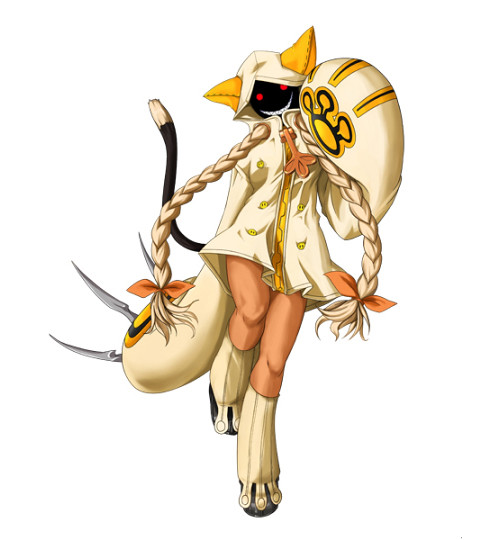
Tying this back to fighting games, the design that stands out for me in BlazBlue’s cast is Taokaka. Catgirls are a pretty common character type, but her design sets her apart from the rest. She has a few distinct shapes that sell her design: big sleeves, exaggerated paws, and a big hood with ears and a fun, mean face. It’s interesting that her boots and paws have a certain circular motif and her coat’s zipper has the paw on it… but ultimately that is all irrelevant, because the hoodie, big claws and mean face are what sell her design. In fact, I’d even argue that her twin braids are unnecessary and distract from the strong points. A good test of a character design is if you can sell the design at a very simple doodle level: Taokaka can be drawn as a doodle and still read as Taokaka because her silhouette is so distinct.
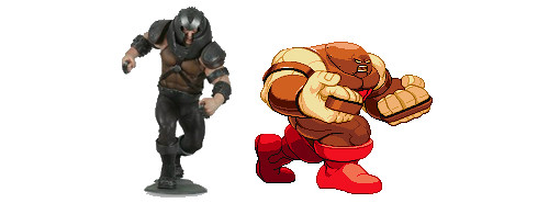
Capcom knows how to take a design and emphasize the strong points of that character’s design, and this comes across in their interpretations of the Marvel characters. I think their Sentinel design is a lot stronger than the original: Capcom’s version looks like a badass robot, as opposed to some big guy in metal underwear. Similarly, their Juggernaut design really brings out that “unstoppable mass of anger” feel by really playing up his helmet and making it flow into his body.
Now, I can’t claim that my own personal character designs always adhere to these principles, since these are observations I came up with over time. Skullgirls’ designs were made over several years, and we’re putting them into the game more or less in order, and because of that, I think you’ll see the characters gradually evolve and adhere to these ideals more closely than earlier ones.
Well, most of today’s entry ended up being me fawning over some of my favorite character designs, but I hope it helped get the point across about what types of designs I enjoy. I’d sum it up like this: the overall theme, structure, and silhouette trump all internal details. If you have to worry about internal details like belts and zippers to make a character unique, something has gone wrong.
Thanks for reading!